
Colombian Picó Graphics Vol. 1
The picó is the sonic street technology local to the Colombian Caribbean. One important feature of picó culture is its strong visual identity. The distinctive flamboyant colors and handmade lettering adorning both sound systems and dance posters are hand crafted by local artists who have created a unique graphic style. This is not a mere ancillary feature but a key component of the culture itself. Colombian researcher Manuel Nieves takes us through the arts and crafts of picó graphics.
by Manuel Nieves
The sound system scene in Colombia is not something you just hear, it’s not a distant gathering of people around the picó but rather a pervasive atmosphere in which culture, space and bodies find a way to express themselves through music, movements, and visual arts. In Cartagena and Barranquilla (the most vibrant cities for picó culture) the local scene pushed sound system owners to create a visual identity to represent the unique personality of each machine. Such personification of technologic and human networks, often in the form of animals, heroes, fictional characters, and so on, is what helps picós to build their unique identity and attract a crowd when they play in the Colombian Caribbean. Both the picós and the venues in which they play share the same, remarkable graphic identity. In other words, you don’t need to hear a sound playing in La Pescadora, Cartagena, to know you’re in a “estadero”, a social club for gathering, drinking, dancing and listening to music.
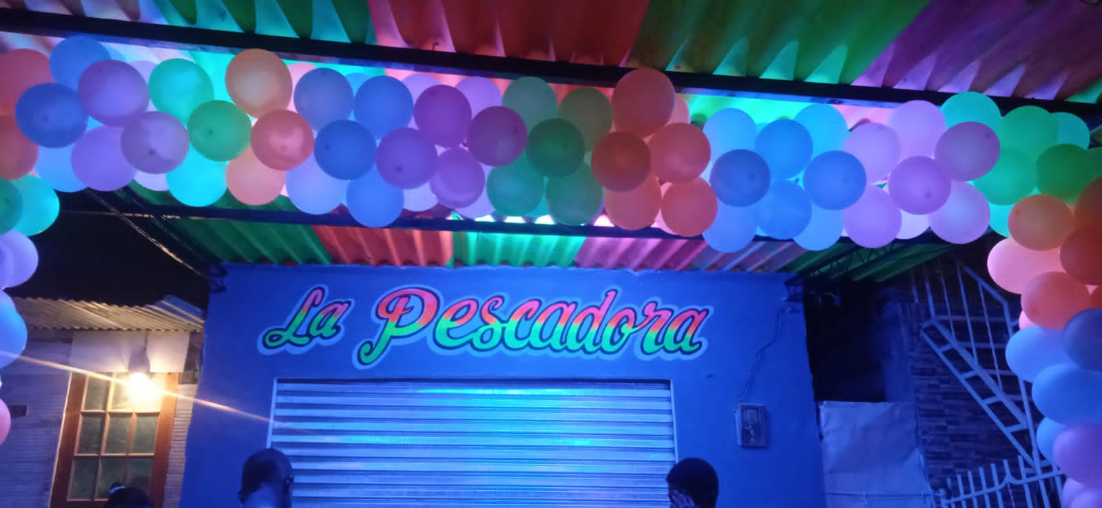
Image 1. La Pescadora, a “estadero” supported by Dairo Iriarte and other popular painters and located in La Maria Calle 41, Cartagena (Colombia).
A systematized approach to the sound system graphics in the Colombian Caribbean must consider two distinct elements: the poster lettering and the sound system painting. On one side, poster lettering relates to the work of popular, self-taught painters who work not just for the picós, but also for restaurants, bars, and other businesses. On the other hand, picó painting, as I call it, is the work of artists specialized in sound system equipment decoration. Over time they have established a recognizable graphic language which adapts to the materiality and contexts of the sound system scene. This blog aims to provide a historical and technical overview of the visual art practices that are a key component of picó culture by dividing our picó graphics into poster lettering and picó painting.
Context and process of poster lettering
Regarding dance posters and their lettering, there are two distinct tendencies in Cartagena and Barranquilla. In the city of Cartagena there is an established practice of poster making, which became a visual signature of places like Bazurto Market. These posters have a very short life cycle since they’re made of bond paper (75-90 g/m2) and displayed across strategic spots of the city. These often end up torned apart by the authorities or by those who put up the posters (cantineros) in order to make room for new ones. In Barranquilla we can find an established practice of posters with a longer life span. Painted on cardboard, these posters have detailed lettering and are placed in strategic spots (mostly on light poles). This is mainly due to the policies around public spaces, which forced Barranquilla painters to switch from murals and big banners to smaller pieces of cardboard, characterized by having a black background.
“When I was a kid, the dances were announced on the walls or with banners, nowadays it’s done with cardboards pasted on the light poles because by the law it isn’t allowed to paint over the walls, nor to put banners across the streets.” Oscar Peña aka Añepracso (2015). [Translated by the author]
We begin our journey in Cartagena. In this city, the posters for picó parties are mass produced by collectives of popular artists like “Los Loros del Cartel” or by iconic figures like José Corredor “El Runner”, who introduced a specific type of graphic which evolved through time to adapt to the changing communication needs of the events.
Which are these communication needs? The answer to this question reveals the reason why these collectives are still a major force in the business, even though their job nowadays could be easily done by computer and printed. But, in order to provide an answer, we must first understand what these posters are and how they are made.
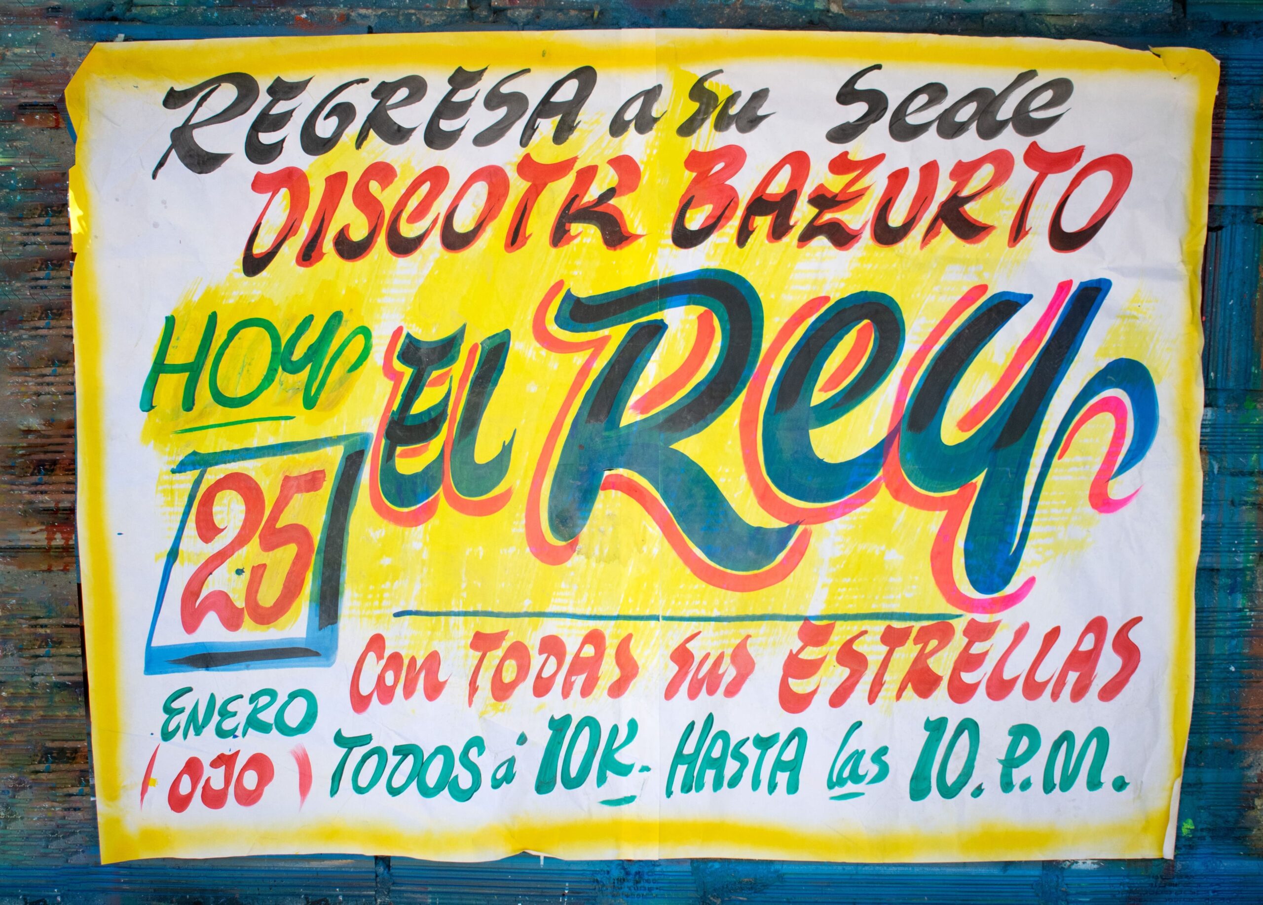
Image 2. Poster for picó Rey de Rocha, by Los Loros del Cartel. Cartagena, January 2020.
In terms of the graphics, we have a characteristic font which is unique to each painter and whose aim is to be visually attractive with simplified shapes (thus requiring less strokes). The posters are composed symmetrically on a vertical axis and have a yellow background for improving contrast; as we will see, it is not usual to leave blank spaces at all in the context of picó graphics.
The basic elements of the poster are: a catch phrase (by the poster-makers); information such as venue and date (usually on a calendar-like square): the name of the main artists, which can be a picó or a DJ, with the highest visual hierarchy [1]; the event sponsors or any invitation made by the collective; and the additional decorative elements, such as framing, stars, or other elements (Nieves, 2020, p. 53-55). These visual features are not merely random choices. To fully understand where they come from, we must be aware of the context in which these graphics are produced.
The promoter (or producer) of a picó event oversees the license application, the logistics as well as the advertising for the dance. This usually means contracting one of the established graphic collectives to produce 100 to 400 (sometimes even more) posters based on demand. But how do these collectives guarantee consistency in terms of graphics and information across all the promotional material?
The workspace where the painters produce posters in Cartagena has a lot of walls, on which the sheets (70 x 100 cm or bigger) are pasted with rubber, side by side. Because of the quantity of posters, it’s usual to find rubber spots that extrude the poster from the wall; so, painting must be light-handed to avoid damaging the sheet. The painting process is a “reversed” assemblage line: the painters move sheet by sheet painting a specific part with a specific color or palette, always repeating the shape in the same spot (previously defined by the group). One paints the yellow background, another the first line, another the main artist, and so on (Nieves, 2020, p. 52).
Usually, the hardest or most important details are left to the most skilled painters, and since each person repeats the painting gesture several times, all posters result to be very similar. Due to the high temperature of the Colombian Caribbean, the paint dries very quickly. So, in very short intervals, a painter can add extra details by using other colors over a letter. This allows a collective of eight painters like Los Loros del Cartel to produce more than 400 posters on a daily basis for any picó event. Since these events are so frequent, and therefore the demand for their work is so high, poster painters had to adapt their graphic style and workflow to be efficient and being able to meet their clients’ expectations.
To continue our journey, we now move to Barranquilla. In this city, the advertising of picó parties is done with cardboards placed on light poles. These cardboards are made in home ateliers, with attention to detail and patience by poster painters like the late Oscar Peña (better known as Añepracso).
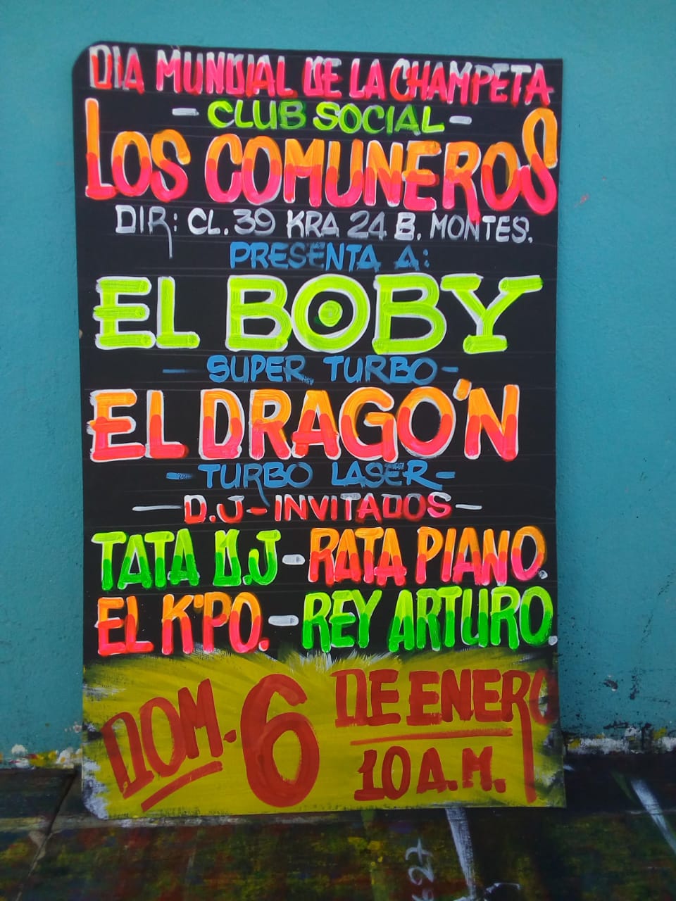
Image 3. Poster for the event presenting the picós “El Boby” and “El Dragón”, made by Añepracso (2020).
Due to the portrait aspect ratio, most of the times these posters also follow a vertical axis composition, featuring a black background over which lines are drawn for composing the different parts; the first layer of the letters is white have a background for the colors to shine. In terms of shape, most of the letters are uppercase and have more complex features: gradients, filets, contours, shadows, and so on. Date and time are highlighted by a yellow area at the top or bottom of the poster, resembling an explosion. It must be noted that, depending on the poster painter, the composition may be more dynamic, adding variations in size, rotations and even figurative elements. The color palette for established picós is also restricted to certain colors:
“Basically, there are four fluorescent colors, used by Añepracso on his posters, and there’s even an established palette for each picó whose events are being advertised (…) To mention some examples: to advertise the picó El Skorpion, the posters feaure letters with two shades of green. (…) El Solista, it’s done with a red to yellow gradient (…) El Dragón is related to iconography, his letters are silhouettes with yellow and red fire, resembling [those of] picó El Rojo. For Cartagena´s picó El Rey, the letters are painted in yellow, orange, green and red.” Barriosnuevo (2012). [Translated by the author]
The contemporary graphics of the picó poster letterings in Barranquilla have a lot in common with the visual style of the picó itself. For example, they have a bold presence of block letters in contrast with black backgrounds. But this was not always the case: way before these graphics were established, we can find records of different styles employed for picó events advertising, closer to those used by restaurants, beauty salons, or during political campaigns.
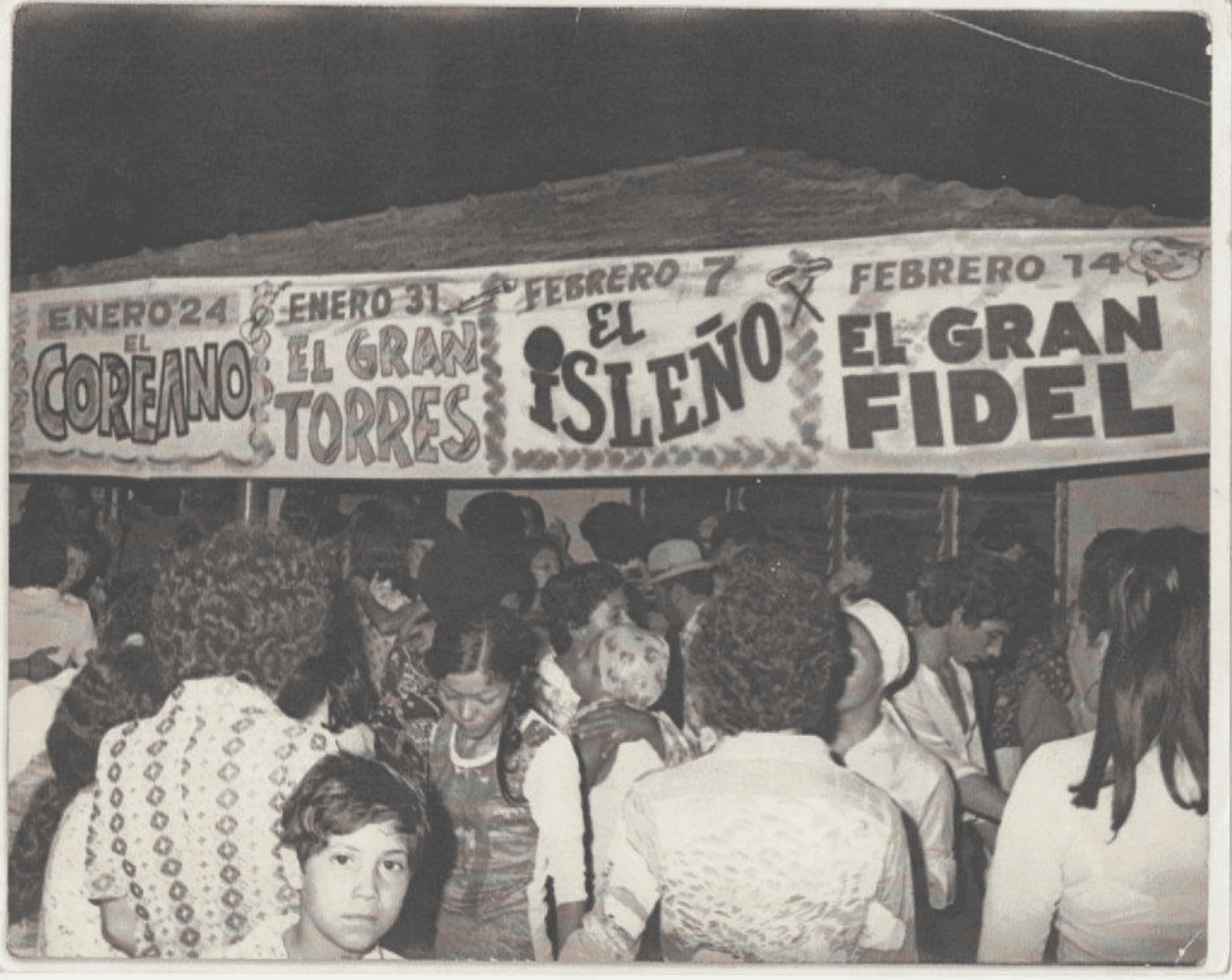
Image 4A. Old photograph of a verbena, by Africolombia.
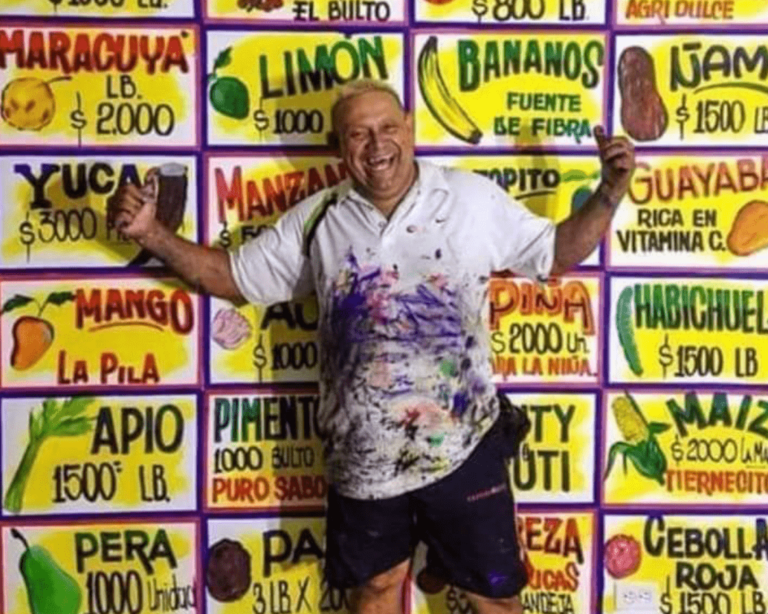
Image 4B. The late great Oscar Peña, by @don_alirio.
Image 4A shows hand painted banners announcing the picós playing each week; the names (El Coreano, El Gran Torres, El Isleño and El Gran Fidel) are painted in a very different style, including figurative elements and decorations. The visuality of this calendar, the posters and the cardboard analyzed above came directly from the tradition of Caribbean poster lettering (as shown in image4B); a tradition that evolved over time to adapt to the changing political, economic, and cultural context (Nieves, 2020, p. 58). New trends, policies and techniques have contributed to consolidating what we currently call picó graphics.
“At the beginning of the 90s, the person who got the idea for the beautiful and eye-catching luminous paint advertisements on a black background was the veteran advertiser who called himself Algesan. Since then, this has become the advertising model adopted for dances and pico events.” Barriosnuevo (2012). [Translated by the author]
We end our journey by restating the most important features of poster lettering: the density of information on different hierarchy scales, the established color palettes and conventions, and the production cycle which involves specialized networks of workshops, collectives and suppliers. The ultimate characteristic of poster lettering and thus picó graphics more broadly can be expressed (in a bold statement) as aleteo (boasting). The broader significance of this term in the context of picó painting will be explored in the second part of this blog.
Notes
[1] In some cases, for maintaining visual uniformity or just making more complex designs, the painters may use wooden templates and spray.
References
Barriosnuevo, Dario. 2012. Añepracso=Oscar Peña, FUKAFRA: Fundación Cultural Afroamericana. https://fukafra.blogspot.com/2012/05/anepracso-oscar-pena_19.html
Nieves, Manuel. 2020. GRÁFICA CHAMPETÚA: Hibridaciones en la producción de identidad visual en el Caribe colombiano. [Undergraduate thesis]. Universidad Nacional de Colombia. DOI: 10.13140/RG.2.2.12969.31843
Peña, Oscar. (2015). Los artistas del picó que dan las pinceladas a la furia de los vatios. El Heraldo. https://www.elheraldo.co/tendencias/los-artistas-del-pico-que-dan-las-pinceladas-la-furia-de-los-vatios-227703
About the Author:
Manuel Nieves is a designer and visual researcher (Universidad Nacional de Colombia), currently doing his master’s degree studying sound system practices involving “pagode” in Brazil (Universidade Federal da Bahia).